Perhaps the most interesting part is that there shouldn’t have to be a competition between Infographics and Presentations (visual formats) as long as you know how to “redesign” them in order to get the most out of them.
For example, when I made the infographic on “The Art of Evangelism” and I put it on the blog I thought that maybe it would be best that I upload it in another format on Slideshare, so I redesigned it in a presentation (this way I even managed to get on Slideshare’s homepage).
But why should we make infographics? How should we make them? Who should make them? Where do we even start designing? How can we promote them? What information should they contain? All this are questions that you might have had one day when you wanted to start making this type of content and maybe at some point you gave up on the idea and left it in the pile of folders, paper and tasks. So let me try to rekindle your desire to give infographics a shot.
My idea is to start a series of two articles on how to make an infographic divided into two main parts: the theoretical part and the practical part. Today we will be talking about the theoretical part:
So, before we get to the next point, give yourself a minute to think about what why you want to make an infographic?
Make the dates and statistics that you already have into a story worth sharing with the world. Moreover, maybe your dates and statistics won’t be enough, so you can also search somewhere else and find resources that might complement your infographic’s story.
Stay away from the infographics with too many numbers and too much text. Here’s an example of How not to.
How useful is the information of your infographic? How fresh is the story told by you? How will this help the person who’s gonna see your content?
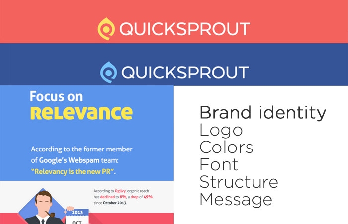
Pay attention though not to stick too much branding in the design.
Be careful not to upload your infographic to Facebook because it will just look bad (I recommend making a banner that would promote the “official housing” of the infographici).
You can also create an account on Visual.ly and upload it there (with the possibility of sharing).
The good part of uploading an infographic on your personal website / blog is that you can provide an Embed Code for those who want to use your infographic and this way you can follow “the activity” of your content.
Additionally, I also recommend making a Pinterest Button (WordPress Plugin) to give the reader the possibility to Pin it directly on his social media channel.
Do the math and see how much money are you willing to spend for the promotion of the infographic, because simply sharing it on social networks won’t bring you more followers or fans.
Conclusion
That’s pretty much how you “design” an infographic in theory. Next time we’ll talk about the skeleton of an infographic, what headline to use, how to present the information, what items to use, dimensions and other details that can help you.
When I moved to Cluj Napoca I decided I want to do what I like.…
Admit it, you’ve already read more than a dozen articles on social media/marketing/publishing trends for…
Yes, I realize this might sound like nonsense (for some of you) and I know…
You can’t reverse engineer success by researching origin stories. You can’t follow the same path…
That’s how you’d like your client to be, right? Crazy enough to accept the new…
Everybody who works in marketing will nod and agree with my next sentence: “Marketing is…