
Stories are everywhere and storytelling is everything.
We consume stories when we talk with friends, recollect memories, watch movies and series, listen to songs or watch/listen to advertisements.
They are part of our lives since the dawn of human society and they will still be here as long as human beings exist.
And, as a marketer, I have discovered as well that stories sell better. They convey messages fast and help the audience become emotionally involved with your branded call to action.
As time passed by, however, I discovered another great thing: there is more to a story than the textual narrative. You can use the images to enhance it or, you can even construct a narrative from visual elements.
And yes, you can tell a visual story with data as well.
Why is this important?
Well…
Research has shown that the brain processes information that comes in the form of visuals or paired with relevant visuals several times faster than text.
In fact, it takes 60,000 times longer to process the text.
Marketers from all industries have all understood this process.
Best storytelling needs data and visuals at the same time.
Therefore, before getting to a real example of a storytelling piece, let’s take a quick look at what we need in order for this process to deliver the best results:
Get to know your story
Whatever industry you are marketing for, there should be enough data for you to collect in order to construct a good narrative. In fact, the Internet has led to a real explosion of data during the last 3 decades which is supposed to help you get what you want.
The hard part is, however, to select from this immense data collection exactly what you need in order to create your story. It will not be easy but it is the first step in your marketing strategy.
You need to know your story in order to be able to tell it, right?
Know the data you will use
Once you figured out what your story will be about, it’s time to find or create the data to support it. Here, you have two options:
- Collect data from several trusted sources and compile it to match your story
- Create a study or survey to come with a new set of data on your own. This will bring more benefits since it will be original content and might get cited and linked back as well by other marketers, bloggers and data collectors.
The easiest way to combine data into a story would be to create an infographic but you might as well create charts to be inserted between the written content. It’s up to you.
However, it is important to understand that visuals are the way to go here. A spreadsheet, for example, may deliver the same information but think about your audience.
How many will read a spreadsheet and how many will read a chart?
Difference between data and visual data
I have mentioned before the fact that we need visuals in order to better spread our data throughout the Internet. Just in case you don’t understand the differences between a datasheet and a visual-data chart, I will go to a simple data storytelling example posted by Hubspot:

The first example shows a basic datasheet, similar to what a reader would find in an Excel sheet.
It’s full of good information but at the same time, it doesn’t attract attention.
Here’s the second example from the same source:

As you can see, the second datasheet, visualized as a chart, is easier to read and understand.
The information is the same but the way we understand and relate to it is clearly different.
Which one of the previous images would you choose?
I guess, the answer is easy to give…
How do you do it better?
The first thing you need to decide is what data you would want to share. Statistics and quiz answers are hard to analyze and sort out if you do not learn how to eliminate unnecessary information. Once you decide what’s important for your audience, you can transform that data into a relevant visualization for them.
And, maybe, write an article to support that data.
Here’s an example from Bannersnack:
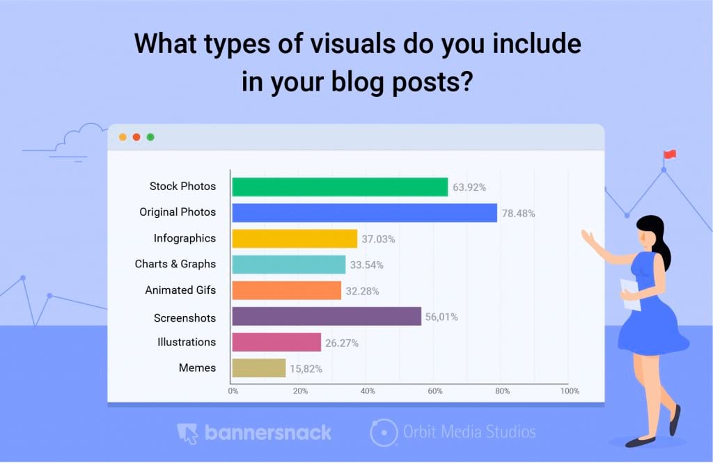
Knowing the audience is also an important part of this process. As you can see from the previous example, Bannersnack addressed a designer/marketer audience which is exactly the right demographic group for their SaaS tool.
You need to do the same thing.
How?
Imagine you are part of your own audience.
And, that you use a product similar to what you market for. Then, ask yourself the following questions that later, you can adapt to that audience as well:
- What do I need to know about this product? Or, what do I need to know about the industry?/ What things would I like to learn about the product/industry?
- What do I need to know about the benefits of using this or similar products?
- Why would I use it/pay for it?
How to start storytelling with data?
Is there a precise way?
Well, yes, there is.
First, you need to collect data. And, there are three types of it, first, second and third party data to select from. Of course, the most important in this case is the first-person data, the information you collect directly by surveying your customers or your audience.
While second data may back-up this information, third party data will give it the basis of trust as people will trust information backed up by more than one source or research.
The best brand storytelling techniques may include one or all three of these types of data. What’s important, however, if you want to tell a story and the audience to pay attention, you need data that is relevant to them.
Here’s a good example from NPR of a great storytelling with data. What did they do?
Well, they chose a popular topic, wrote their narrative and enhanced it with powerful and easy to understand visual charts based on actual data collected from several sources:

The above one is also a great example of interactive data storytelling since each of the graphs gives the audience the chance to look at it from their own perspective based on their fields of interest.
Finally, I will conclude with an interesting example of a chord diagram, a type of diagram that, from the looks of it, adds a little bit more style to your story, making it stand out from the crowd.

The example comes from Visual Cinnamon who created the diagram using actual data from a survey conducted by Deloitte on the mobile behavior of people from the Netherlands.
As you can see, this is yet another well designed interactive visual which allows users to switch between brands and visualize data based on their selection.
We can learn from these last two examples two important things: First, that data becomes easier to understand when it is displayed as charts or diagrams and secondly, that interactivity ads flair to your data, making different aspects of it more accessible to the user.
The power of original research
Before concluding, let’s make just another quick stop and talk a little bit about original research. Remember the part when we discussed the three types of data?
Well, original research is the most important part of those three and it is a “first-party data” at the same time.
Original research can help you get more exposure as other marketers and bloggers will quote you and link back to your research pages if the content is original and well researched.
What are the most important types of original content you can use? Let’s take a look at some of the best examples:
1. Case study
You can take a closer look at your company, brand or products and at the same time at your industry, by conducting a case study around your own interests and fields of expertise.
Find out how the audience relates to similar products, what are their intents and purposes, what expectations they have from a brand like yours. Publish your results and use the data as a marketing ladder.
Here’s an example from Bannersnack, a case study that collected data from more than 200k users on banner ads trends.

2. Experiment
Another good option in this area is to conduct an experiment and publish the results online. You can get the same benefits as above as long as you know your audience and what other marketers from your industry want in terms of original data and information.
Here’s yet another example from Bannersnack:

The experiment was conducted on different types of Verison ads and it shows the audience how to proceed on this platform, based on actual data, in order to achieve the best results.
3. Get feedback from your peers
Original research can mean more than research in a traditional way. You can achieve great results by publishing original data without conducting a study or writing your content. How?
Well, you can get feedback from your peers.
You need to ask a question, send it to your peers and let them know that you will use their responses as a base material for your content.
Get their responses, adjust them for your blog and compile a comprehensive study-based article with everything you get from them.

The final step would be to promote this original content as storytelling with the data type of content. As I already wrote in a previous article on how to promote such content, you need to start from what you have, publish it, promote it on social media, forums and online communities, write as many guest posts as possible or do co-marketing projects and of course, use as many tools as possible.
Conclusion
Storytelling is and should be the most important part of any modern marketing strategy. You cannot, however, tell a story without using the right words and a good narrative. And, when it comes to marketing, people need facts and not just empty slogans.
This is where data storytelling makes its entrance. It delivers the story but at the same time, it tells the narrative by using actual relevant data to the audience. A win-win situation for both the marketer and the client.
Did you use data storytelling in your past or present marketing strategies? How often did you do it?
Leave a Reply